The Public Pulse Report 2023 from Gallup Pakistan last week has stirred a lot of debate, to the point of being ridiculed on social media. As a policy researcher, one cannot help but express dismay at how a globally recognised and standardised research tool has been reduced to a joke. Therefore, I propose a comparison of the 2022 and 2023 pulse reports.
Let us start with the definition – a perception survey is a research method used to collect data and information about how individuals or groups perceive and interpret specific subjects, issues, or situations. These surveys are designed to gather insights into people's attitudes, opinions, beliefs, and feelings regarding a particular topic.
When used for socio-political perception analysis, perception surveys aim to understand the factors that influence perceptions to unearth the cause and effect behind socio-political behavior. It becomes a process of examining and evaluating how people perceive and interpret information, certain events or political cleavages. Added to this is also the perception of and the role of political leaders.
Now let us compare the construct of the 2022 and 2023 Pulse Surveys.
Such types of perception surveys are ideally administered to a target audience or population over a period of time. Its selection depends on the research objectives, such as determining the public opinion of a political leader, a political party, an event or a political situation at the national to local level.
Through a structured questionnaire, interviews are conducted via different methods including telephone, face to face or both. Once the survey data is collected, researchers analyze the responses to identify trends, patterns, and insights related to how the participants perceive the subject matter. The perception surveys, like being discussed, are also used to establish benchmarks or track changes in perception over certain period of time.
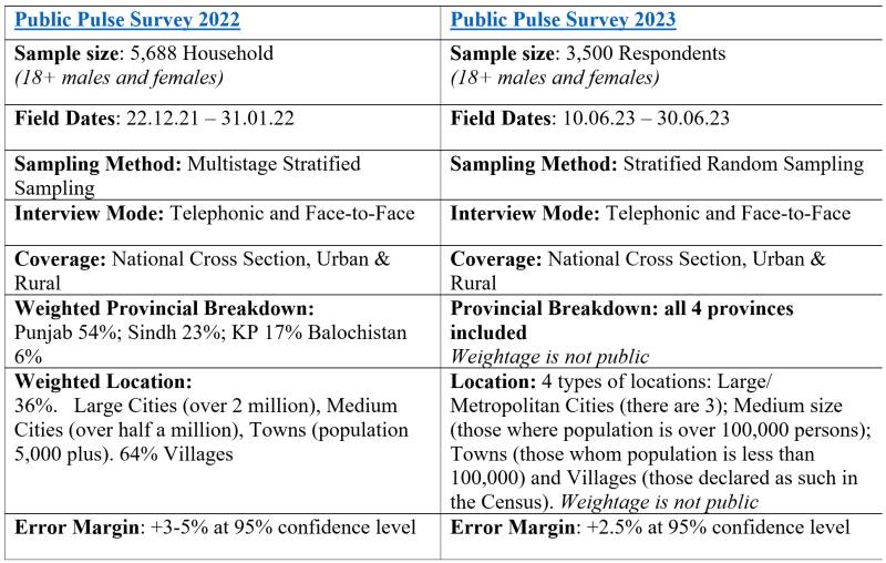
The key is to maintain the consistent sample size, methodology, stratification and preferably the same questionnaire. However, the table above illustrates the difference at all levels raising the question that are these two surveys even comparable. And if the annually repeated Public Pulse Survey is not comparable across years, then what is its value addition in public discourse?
Critical elements in any perception analysis
The margin of errors and removal of bias are two essential elements in considering the perception analysis. The margin of error measures accuracy; it does not measure the amount of bias that may be present. Results that look numerically scientific and precise do not mean anything if they are collected in a biased way. People often make choices based on their perceptions of available options. The biases (cognitive, cultural, political, religious, etc.) are to be understood by examining how people perceive and make judgments, including the formation of stereotypes and impressions based on social, cultural, or demographic factors.
If the annually repeated Public Pulse Survey is not comparable across years, then what is its value addition in public discourse?
What is also important to consider is that this contextualized analysis includes how the media and other communication channels, consisting of social media and political rallies implement political messaging strategies which include leadership pressers, speeches, statements. All of these amalgamate to influence the electorate’s perceptions.
The 2022 Pulse report had a commentary contextualizing the survey authored by the Executive Director, Gallup Pakistan stating that the “views of the Executive Director do not necessarily reflect the views of the organization.”
It is interesting to note that the organization conducting the perception survey did not validate the analysis of its own Executive Director – thus posing a question that why did it was even used? The 2023 report (web version) does not have anything to that effect to contextualize the public mood for the report.
Examining the content of the reports
The change in focus is evident from a cursory glance at the Table of Contents of both reports - when read in conjunction with a changed sample size and sampling approach, the question arises on the consistency and efficacy of a tool to gauge the perceptive change over a period of time. Why change the logic and mode to assess the annual public pulse? It is understandable to add the additional questions and lens e.g. economy and electricity but why change the goal post? Or is it intended to bring forth recognition for some, and demonize others?
Comparing the key question of the two reports
Opening question of any survey reports sets the tone. The 2022 Pulse Report starts by asking ‘what is Pakistan’s biggest problem?’ Whereas, the Report for 2023, asks ‘overall are you satisfied or dissatisfied with the way things are going in our country today?’
No scale is offered to the respondent to define what is a ‘minimum’ that must be considered by them to gauge their satisfaction and dissatisfaction while answering this question. There is no generic scale of satisfaction in public or academic discourse that could be taken as a given and known to most of the respondents. For each gender, income group, province, party lines, etc. the answer would be different, like each to its own. This clearly reflects that the intent of the question in general and survey in particular was not to gauge perceived satisfaction of citizens but to collect negative responses given the then prevailing political dejection post May 9 2023, as data collection was done during June 01-30 2023.
Continuing with the same absence of scale, the survey inquires that ‘would over the next 12 months do you expect the economic situation in our country to improve a lot, improve a little, remain the same, worsen a little or worsen a lot?’
Again, there was no scale or set of economic indicators that were shared with the respondents to consider contextualization and help them make an informed prediction about the probability of any change in economic situation. Without a scale i.e. set of given indicators each respondent will have a different understanding and choice for economy to improve from an individualistic perspective.
One does not except all respondents to have understanding of the fiscal and/or monetary policies and need for structural reform, budgetary deficits, circular debt, weak tax to GDP ratio, etc. to provide a nuanced answer. Hence, again a clear indicator that the intent was to generate yet another negative response.
The most similar question between the two surveys is ‘2022: what is biggest problem of Pakistan’, which in 2023 got changed to ‘rate problems on scale of serious, minor or no problem in our country.' The two reports did not maintain the same issue categories. In 2022, inflation topped as the answer with 64%, followed by unemployment 21% and corruption with 7% at third place.
For the year 2023, except for these three, none of the same response categories were used. Inflation still topped with 89%, followed by unemployment at 88% and corruption with 82% at third place. Poverty shared the second spot with unemployment with 88%. Poverty and unemployment have a clear cause and effect relationship, hence the question that why put them in two separate categories?
Another shared indicator in the two reports was load-shedding titled as ‘electricity shortage’ which was at 1% in 2022 and 78% in 2023, which demonstrate a stark shift. Rising electricity tariff was added in 2023 response category that reflected 82% dissatisfaction.
The security situation was over emphasized with four response categories listing terrorism and TTP as two separate categories. This poses the question as to why divide terrorism in TTP and other militant groups in FATA as well as the security situation in your specific area and religious extremism? Interestingly these categories do not get any contextualization in the report nor are they used to demonstrate their respective impacts on the country’s politics, economy and/or state of democracy.
Political instability, the most relevant response category, as used in 2022 report, was surprisingly removed from the list of major issues faced by Pakistan as a category in the 2023 survey. The events leading up to and after the first ever removal of a Prime Minister through the Vote Of No Confidence (VONC) ushered a new version of political instability in Pakistan, that not only resulted in the events of May 9, 2023, but continue to define the nation’s political landscape. So how can this category be deleted in a perception survey aiming to record the democratic and political pulse of the country in the midst of political turmoil.
Importance of the construction of the question and response categories in a perception survey
Response categories and the way they are presented in the context of a specific sentence are very important because they can lead, detract and add than remove any bias. The banner in each response category also highlights more negatives than positives. Let us examine the 2023 survey.
Section 1.6 banner states: ‘47% often or always discuss current events with friends.’ There are two issues here. The question was asked about three things i.e. politics, government and current situation. But the banner chose to use the word “event” only – why? Perhaps it wanted the reader and rather media’s attention to go towards “an event only” of May 9 in this case. This is what the media picked and reported. The response category had ‘never’ (20%), ‘rarely’ (27%), ‘sometimes’ (37%), ‘often’ (15%) and ‘no response’ (1%). The data set is indicating that 52% respondents sometimes to often discuss politics, government and current situation. But the banner chose to state that 47% ‘often’ or ‘always’ discuss current events – which data is being tabulated here? No two response categories are adding up to to 47%. And why was the response category ‘sometimes’ replaced with ‘always’ which was not even listed?
Section 1.5 banner states: ‘20% think democracy is not delivering at all.’ Whereas, the data set is not supporting this statement on the banner. This is against an ambiguous question that asks: ‘Some people think that democracy in Pakistan is delivering to Pakistani public in a satisfactory way. Others think it is not delivering?’ The response categories included: (i) Democracy is delivering in best possible way (18%); (ii) Democracy is delivering in somewhat satisfactory way (32%); (iii) Democracy is not delivering (28%); (iv) Democracy is not delivering at all (20%); (v) Don’t know (2%).
There is no difference between response category ‘iii. Democracy is not delivering’ and ‘iv. Democracy is not delivering at all.’ It makes one ask that were these presented as two separate response categories and if so, then why? Or was it an open-ended question that was transcribed? It is a clear inference that the survey question and response categories were constructed in favor of generating a negative response and the banner is purposely misleading.
The banner statement is also misleading that 20% think ‘democracy is not delivering.’ Whereas, the data shows that 50% of the respondents think democracy is delivering in a ‘best to satisfactory way’, against 48% for whom it is ‘not delivering at all’. Why this misstatement?
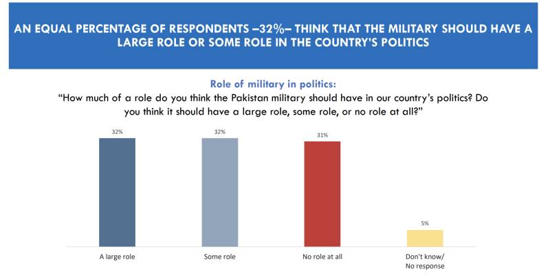
The leading inferences continue in the next question which asks: ‘How much of a role do you think the Pakistan military should have in our country’s politics?’ If the idea was to understand the grasp of democracy and functional democracy’s perception (ref point 2 above) then the question should have been: ‘Should the military have a role in our country’s politics? The response categories included (i) ‘Large role’ (32%), (ii) ‘Some role’ (32%), (iii) ‘No role at all’ (31%) (iv) ‘Don’t know’ (5%).
Constructing the question in this way not only assumes but lets the respondent also assume that the military has a role in politics, which cannot be even implied in a democratic perception survey or analysis. It is technically a misleading construct of a question. The banner statement was again misleading where it says ‘32% think the military should have a large or some role in politics.’ The data set informs the figure to be 64% for the response category large to some role.
The banner indicating provincial collation of responses of the same question states that ‘46% in KP opt for no role of the military in politics; less than the other provinces think so’. Interestingly, the data in this section informs that 74% of respondents from Balochistan opted for a large to some role of military in politics. Given the current to at least last 10 years political landscape of Balochistan, this data set cannot get any more skewed than this.
Section 2.1 focuses on the approval rating of institutions that hold power. In the survey report for the year 2022, the State institutions of power were categorized as the National Assembly, Provincial governments, government employees in general and their performances were the key indicator.
Comparatively in 2023, the list of institutions whose performance is being asked to rank are (i) ‘Army’; (ii) ‘Media’; (iii) ‘Courts’; (iv) ‘Election commission’; (v) ‘Local Governments’; (vi) ‘Police’; (viii) ‘Parliament’; and (i) ‘Politicians in general’. Interestingly, the provincial governments are taken out as an institution of power or whose performance must be judged. This one question is interpreted in 5 slides with provincial perspective. Each banner is interestingly articulated to pull-up or pull-down a preferred institution. The banner continues to have data errors in individual and cumulative slides.
The banner on first slide focuses only on the strong approval of the job done by the army (57%) and somewhat approval of the media (41%). Interestingly the courts hold exact same approval rating as the media 41%, but do not get even a mention.
The banner on the second states that 51% ‘somewhat approve’ of the work the civil service is doing and 34% ‘strongly disapprove’ of the work being done by politicians in general. The only category of civil service being available in response category is Police but why is it called civil service which in actual it comprises of at least 12 occupational groups? The data informed that cumulatively 54% ‘strongly to somewhat approve’ and 36% ‘somewhat approve’ their performance but the banner says 51% ‘somewhat approve’ – why this misstatement?
Same is the case for the politicians for whom the banner says 34% ‘strongly disapprove’ of their work. Again given the post May 9 situation, the statement on the banner is reflecting the survey’s bias to purposely tilt it against the politicians.
The data informs that 39% ‘strongly to somewhat approve’ politicians’ performance. Hence the question that why does the survey choose to apply a negative depiction? And if the negative was to be highlighted then it should have said that 54% strongly to somewhat disapprove politicians’ performance.
The banner on the third slide reflects the cumulative approval of the job stating that approval ratings are highest for the military at 88%; followed by 69% for the civil service; and politicians, election commission and parliament have the highest level of disapproval among the public. Only the police is considered as civil service and while the data informs it has 54% approval rating, the banner states it to be 69%.
As per the banner, the Election Commission (EC) 42% and parliament 47% have the highest level of disapproval among the public. However, for the EC it received a rating of 42% approval and 47% disapproval; Parliament on the other hand received a 47% approval and 43% disapproval. The data does not match the misleading banner statement.
The courts are again purposely sidelined in cumulative reflection and not mentioned again until the fifth slide. This is despite the fact that it has 56% approval rating which is second highest after the military and a shared spot with media. Given that it’s a political perception survey and post May 9, the courts were the democratically balancing factor, then why is their performance being pulled down?
Local Government with 51% approval rating – third in ranking – also fails to find any recognition. At the provincial level, the military and the media have top positive approval ratings. Interestingly, 46% of KP did not want ‘any role’ of the military in politics (ref point 3 (c) above) but it gets a 91% positive approval rating in the province– how can this be explained? Punjab and Sindh approved of the army’s role in politics with 66% and 61% respectively but when it comes to approval rating it goes up by 90% and 88%, respectively.
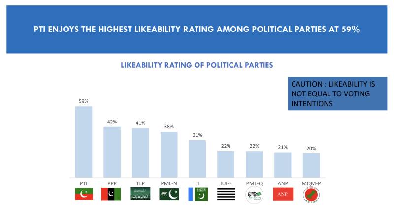
The significance of the likeability of a political leader and political party.
The 2023 reports presents following as the likeability graph of major political parties.
The 2022 survey report had put forth a positive approval rating of political leaders: Nawaz Sharif (55%), Shahbaz Sharif (51%), Imran Khan (36%), Bilawal Bhutto (28%) and Asif Ali Zardari (24%).
In 2023, it is as follows.
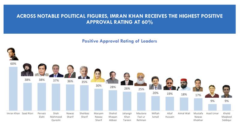
The above two graph-shots are a picture of self-contradiction. Going by the data, if the PPP has 42% likeability nationwide, then how come both Asif Ali Zardari and Bilawal Bhutto are not figuring in the list of approval rating for political leaders? Does it mean that 42% respondents who liked the PPP chose their favorite political leader to be from another political party? It simply cannot be – it does not work that way.
The inclusion of Miftah Ismail, Mustafa Nawaz Khokhar, Shahid Khaqan Abbasi, Jahangir Tareen and Khalid Maqbool Siddiqui raise further eye brows as none of them occupies a political leadership role at the national or provincial level.
All of them have had a single constituency presence and were in political frontlines due to the political leadership of their respective party; except Shahid Khaqan Abbasi who served as the PM and yet lost even his own family seat in the elections of 2018, and was re-elected from the secure seat given by Mian Nawaz Sharif in Lahore. These are listed in positive approval ratings as political leaders, but the Chair and Co-Chair of a leading political party - PPP ranking at second position when it comes to likeability - is unable to get even a mention in the political leadership listing? It is nothing but an obvious bias.
Inclusion of the TLP
The inclusion of TLP at the third liked party ranking and Saad Rizvi at second position with approval rating is another glaring contradiction. This further conflicts with its own finding that 56% respondent indicated religious extremism as a major problem for Pakistan.
The TLP has a limited presence in some districts of Punjab. This argument is further validated as in the voting section of the report informs that only 4% respondents stated to prefer to vote for TLP nationwide.
Provincially it was 6% in Punjab with 1% below in other categories. With this data set how could the party be third at likeability and its leader at the second ranking of positive approval for political leadership.
Interestingly, the party and its leadership was totally ignored in 2022 report. This alone jeopardizes the whole credibility of this survey and that of Gallup. It neither adds statistically nor contextually.
Pick and choose
Perceptions are highly influenced by the timing of the Survey and any important event of that time. To match the 2022 report cycle, the 2023 survey report ideally should have at least followed the same time line of December 2022 to January 2023.
For reasons known best to the surveyors the timing selected was June 1 to 30 2023. This on the face of it and all that has been discussed above, implies that the May 9 2023 event was a trigger to field the report.
Voting behaviors are trickiest to predict as any event close to the election day can create a wave in favor or against a political party or leader. When the 2023 survey report’s Section 2.5 on voting intentions is read within the above articulated political context, it indicates that the questions and timing of the 2023 survey have clearly been constructed to illicit a targeted response in favor of PTI and against PML-N in particular as well as other political parties in general.
Let’s discuss the questions, including their provincial reflections as follows.
‘Thinking now about national elections, if the national assembly elections were held next week, which party would you vote?’ 42% stated they would vote for PTI followed by 20% for PMLN and 12% for PPP. It is not surprising that a survey fielded in less than a month after the events of May 9 will inform that the victimhood sentiment goes in favor of the PTI. However, the surprising part is that the PML-Q is able to record a likeability of 12% as a party, but if voting is held next week, under 1% of respondents would chose to would vote for it. In the provincial reflection, it fails to make even a mark even for Punjab at 1%; but its leader Chaudhry Parvez Ellahi is able to get a positive political rating of 38%. The last could be attributed to his joining PTI, but at the time of election he was not taken as second tier leader of the PTI. A similar situation is documented in the case of the TLP.
On the one hand, the PPP having 42% party likeability, 12% voting preference in immediate election scenario but its main political leadership fail to make a cut for positive leadership ranking. This could not get any more biased against PPP.
None have attempted to have an expert read it to get a sense that in the name of perception, a certain direction for our political landscape and leadership is being sold.
‘Which party would you never vote for?’ First of all, the question itself is leading and is in absolute term. While gauging voting behaviors the term ‘never’ has no place as voting behaviors keep changing as per the events in run up to election day and more so by events occurring in closer time lines to election day.
The question should have been phrased to be indicative of a choice of respondent for specific time period than an absolute decision for all times. It could have been stated as “could there be a party that you may not prefer to vote?” This construct would have reflected two things - is voting still a preferred choice and the level of trust in electoral practice and democracy. Both are critical in a perception survey yet survey chose to have ambiguous and far from the point construct of the question.
While elaborating provincial reflection of this question, the banner of the report again is misleading that makes us infer the skewed tilt in favor of the PTI which is recurring in the whole survey.
The banner states it as a case of the PTI vs PDM by stating that ‘PDM combine beats PTI in all provinces but KP.’ Besides being ill intended, it reflects poorly on the understanding of the Gallup team, because the fact remains that PDM was not an electoral alliance, but a political alliance i.e. to form minority government and not to contest election. Whereas the intent of question is clearly to bring out the perception regarding electoral processes.
The survey’s bias gets more obvious as for provincial reflection the banner states that overall ‘people would never vote for PML-N except in Punjab where there is a tie with PTI.’ The banner qualified its statement as level of polarization in the province, whereas it actually is indicator of the survey’s bias.
‘If PTI does not stand in elections then which party would you vote for?’ 24% respondents stated that they would prefer the PMLN, 20% PPP and 23% either did not reply or replied ‘don’t know who to vote’ in case the PTI does not contest election. The 23% that did not reply or replied as ‘don’t know’, is statistically huge number that should have been deconstructed to inform that what does it mean.
Does it mean respondents were unsure if they would vote? Or were not sure that if they would vote for a specific party out of those listed as an option? These two are important in a perception analysis and cannot be ignored.
But the bigger question is why does the sub heading of the section state ‘New Political Party?’ which even as a word is not even mentioned anywhere. Again, construction of the questions to the timing of survey confirm the continuous bias reflected in positive political leader rankings given to Miftah Ismail, Mustafa Nawaz Khokhar, Shahid Khaqan Abbasi, Jahangir Tareen and the erasure of Bilawal Bhutto-Zardari and Asif Ali Zardari from the same list.
These are some of the many lacunae in this perception survey, which has managed to get the best screen time for the last few days. Yet none have attempted to have an expert read it to get a sense that in the name of perception, a certain direction for our political landscape and leadership is being sold.
An exercise in legitimation
Why is the military which has no role in politics being sold as a savior? Why is the media being stated as a State institution, having power when its job is to disseminate fact based information and facilitate objective opinion making? Why is the role of courts having better rating being downplayed? Why is a radical religious political party being promoted despite all numbers being against them?
Such clouded – cum – sponsored political perception analysis can never indicate any clarity on political pathways rather it can only trap us in the spiral that is our political circus.